What might the proposed new boundaries for Liverpool Council mean for the city's political parties?
Plus ça change, plus c'est la même chose kidda
Anyone who has taken even the briefest interest in Liverpool’s politics will know the city is in uncertain times. I don’t want to go into the ins and outs of the Caller Report because life’s too short and I’m not getting any younger. But we’re now in a position where the city may scrap the mayoral model of governance (see my thoughts on that here) and our local electoral geography is being ripped up and rebuilt from scratch.
The proposals
As it currently stands, Liverpool has 30 wards, each electing three councillors over the course of four years. Simple.
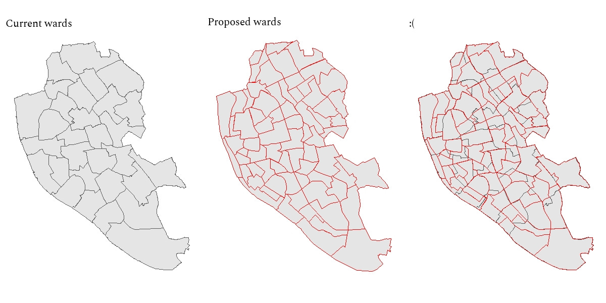
The government, however, seeks to change this. The Local Government Boundary Commission for England (LGBCE, not to be confused with LGBTQ+) has produced new proposals for a council with 85 councillors across 71 wards: 58 single-member wards, 12 two-member wards, and one three-member ward.
I can feel the public’s trust in local politics returning already.
Currently, the average ward size is 10,886 electors (the smallest is 8,941 and the largest is 14,597), equating to an average of 3,629 voters per councillor, whereas the new proposals will increase this to around 4,300 voters per councillor. For a country that is already relatively underrepresented compared to its European counterparts, this doesn’t feel great.
One upshot, however, is that in these new wards, especially the single- and double-member wards, the average electorate will be smaller. If we assume a turnout of 31% - the 2021 local election turnout - this means that approximately 1,333 voters will actually vote, and in a three-horse race, a candidate could conceivably win with just ~450 votes.
The smaller the electorate gets, the greater the potential for upsets.
I’m interested in what these reforms might mean for party politics in Liverpool - will these smaller wards help or hinder the non-Labour parties on the council? We could see why this might help. Currently, if a ward has a geographically-concentrated pocket of, say, Green support, and the rest of the ward is solidly Labour, the Greens will never win a seat. But, if the ward is split into three, and the pocket of Green support now becomes the core of a new ward, the Greens have a much better chance at victory.
So, the potential is there for a more diverse council chamber.
Unfortunately, the new proposed wards do not map on neatly to the current wards.1
This poses a question: how can we predict electoral outcomes in the proposed new wards when they are completely different to the current wards? The answer: the OAs.
Methodology
(If you’re not interested in the methodology and you just want to get to the payoff, skip down to the results section, I don’t mind)
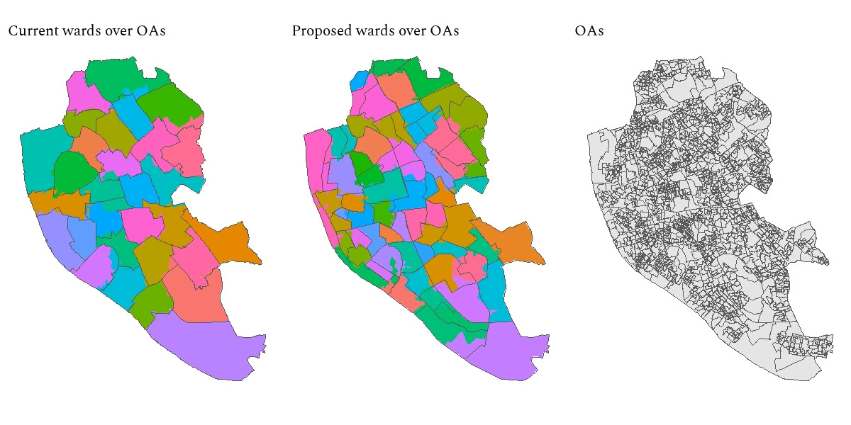
The OAs. Not just the name of a Netflix series that was cancelled well before its time, but also the lowest level of census data, known as Output Areas. OAs represent the lowest geographic level for which census estimates are provided. Each OA represent roughly 309 people. This is granular stuff.
This image shows OAs within Liverpool’s current wards and OAs within the proposed new wards. Generally speaking, OAs are expected to fall within ward boundaries, but this is not always the case. I’ve colour-coded each OA by the ward I’ve assigned them to (since there are around 1,500 OAs in Liverpool a simple overlay just looks messy).
Obviously, this isn’t perfect. It’s an art as much as a science. And my art was so shit I wasn’t allowed to take it for GCSE.2 But it is clear that OAs align much more neatly with current wards than the new proposed wards: the LGBCE seems to have no interest in respecting OA-ward alignment, but let’s not make the perfect the enemy of the good - they’re still a useful starting point. Often where you see an OA encroach into another ward, this is an uninhabited area like a park or a Joe Anderson-approved property development in China Town.
Anyway, why all this talk about OAs? Well, dear reader, it’s because they’re useful for building up a socio-demographic profile of each new ward. The 2011 census provides the same socio-demographic statistics for wards as it does OAs. Since I have assigned each OA to a new proposed ward - the middle map above - it is simply a case of summing the census counts for each OA within a ward, dividing by the total for each metric, and voila! we have census profiles for each of the 71 new proposed wards.
And this leads us to the second aspect of the methodology: regression analysis.
We can use regression analysis to build a statistical model to predict party performance in a given socio-demographic context. We can then use this model to predict party vote shares in other contexts - in this case, our new wards.
Firstly, I got my election data from Andrew Teale’s excellent Local Elections Archive Project (check it out here). I decided to train the model on the most recent set of local election results, 2021, for Labour, Tory, Liberal Democrat, Green and Liberal parties. I included a range of census data covering identity, ethnicity, religion, health, language, qualifications, employment, class, and students. Due to the geographically-concentrated nature of Liberal Party support (currently in the Tuebrook and Stoneycroft ward), I included a dummy variable to control for this.
My model successfully predicted the winning party in 90% of the seats in the 2019 local election (three Labour seats were predicted to be Liberal Democrat wins) and 86.7% of the 2018 election (where the same happened, plus one Green seat was predicted a Labour win). It even predicted 76.7% of the 2008 results, showing how little changes in Liverpudlian politics…
In terms of vote share, the average difference between results and vote share was 4.7% in 2019, and 6.5% in 2018. This isn’t bad for a model which can only rely on census data and includes no political variables whatsoever!
Differences were larger for Labour (largely because they tend to overperform in some northern wards, building up massive majorities where opposition is weak and turnout is low) and lower for the Conservatives and the Liberals. Overall, my model tended to overestimate Liberal Democrat support (#JoSwinson4PM) and underestimate Labour support.
So, now I’ve validated my model and shown it to be pretty good when tested on real-world election data, I can now apply it to the proposed new wards.
Results
For those methodologically-adverse readers, welcome back!
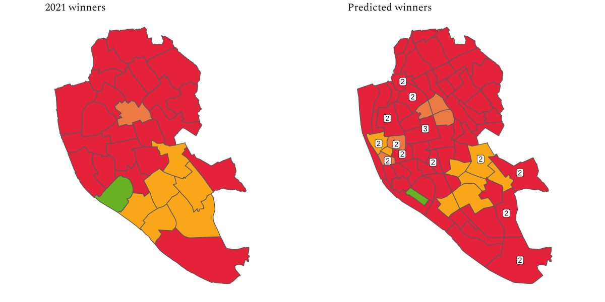
Without further ado, let’s see what would Liverpool look like under these new wards.
The map remains quite stable: the Liberal Democrats generally do better across their southern belt, although it looks less impressive under the new boundaries - this probably speaks to differential turnout and the fact that current wards bring together quite different socio-economic and demographic profiles into single wards.
Labour remain strong in the northern half of the city and also appears stronger down the waterfront under the proposed wards, compared to appearances under the current boundary system.
The model estimates that the Liberals would hold on to three of the four wards which cover their stronghold in Tuebrook and Stoneycroft (the one ward they don’t is a three-seat ward, where any Liberal vote is drowned out by emphatic Labour support).
There also seems to be something happening in the areas around Everton and Central wards - four of the new wards which emerge from these areas swing away from Labour, and of the seven seats that switch the Liberal Democrats gain three and the Liberals gain four. There are grounds for pessimism here - these areas might look similar to Tuebrook and Stoneycroft, the area of current Liberal strength, but the Liberal’s appeal is very much a local one and probably won’t translate well across to other parts of the city.
The Greens are in for a bad time - their support in the current three-seat ward of St Michaels is reduced to strong support in just one single-member ward (also called St Michaels), but they might take heart in the fact that they are within 10 percentage points of the winning party in five wards (generally quite studenty/young professional-y areas - City Centre South, Greenbank, Sefton Park, Penny Lane, and the odd one out, Gateacre).
In fact, the Gateacre ward deserves a shoutout, as it looks like it could be the most contested ward. Although the Liberal Democrats are projected to win it, that is on about 25% of the vote. Both Labour and the Liberals are under 5% behind, and the Greens are around 8% behind. This is also the ward where the Conservatives are closest to the party in first place, at just 16% behind.
In true Liverpool fashion, even when it seems everything has changed, nothing has really changed.
Labour would go from 78% of seats to 79% and the Liberal Democrats would go from 13% to 12% (10 seats). The Greens are the real losers, dropping from 4.4% of seats (4 out of 90) to just 1 seat. The Liberals are the real winners, going from 3 seats (3.33%) to 7 seats (8.3%).
So, the question is: how does this help meet the aims of the Caller Report?
Well, to be truthful, it doesn’t. Labour will still run the city, but with the added ‘bonus’ that if you’re in a ward with a crap councillor - maybe one who decided to live in Spain… - then you are goosed for four years. Most voters will have the misfortune to live in single-member wards, and so there’s a very real chance they’ll have no representation for the best part of four years, whereas under the current system even if one councillor is rubbish (perish the thought) there are two others to pick up the slack.
There is a very simple way for the government to inject life into effective one-party councils - and that’s PR. Break Liverpool into fifteen wards with six members, elected by STV, and you’d breathe life into Town Hall in an instant. (I did some analysis of what Liverpool might look like under various forms of PR here).
A second policy, more effective than tinkering with executive arrangements, is for central government to fund ‘local government scrutiny panels’ - like jury service, citizens would be selected to hold the council’s executive to account for a given period of time.
Anyway, this is the first of a two-part series (yes, I know how to drag it out…). In the second part, I’ll be looking at how the results might look if the Conservatives went back to their 2008 levels of performance and how the results might look if 2021 second-placed mayoral candidate Stephen Yip had started a party off the back of his impressive mayoral run.
Unlike its big brother, the Boundary Commission for England, the LGBCE did not release shapefiles for the new wards, so I had to make these by hand using the wonderful QGIS software.
Shoutout to PapaJ, who on being told this at a parents’ evening, turned to MamaJ and said ‘oh well, it’s just art’.


